My Top 50 Shelf Styling Tips
The Shelfie. The what? Yes that was me a few years back when I took my first tentative steps into the world of interiors on Instagram. I’d always loved interiors and styling in my home but I had no idea of what a ‘Shelfie’ was! Four years down the line I like to think I’ve honed my skills, with many a shelf styling session. So I’ve put together everything I’ve learned both by trial and error and seeing what works and what doesn’t but also by picking up many invaluable tips and tricks along the way from my fellow instagrammers, stylists and designers.
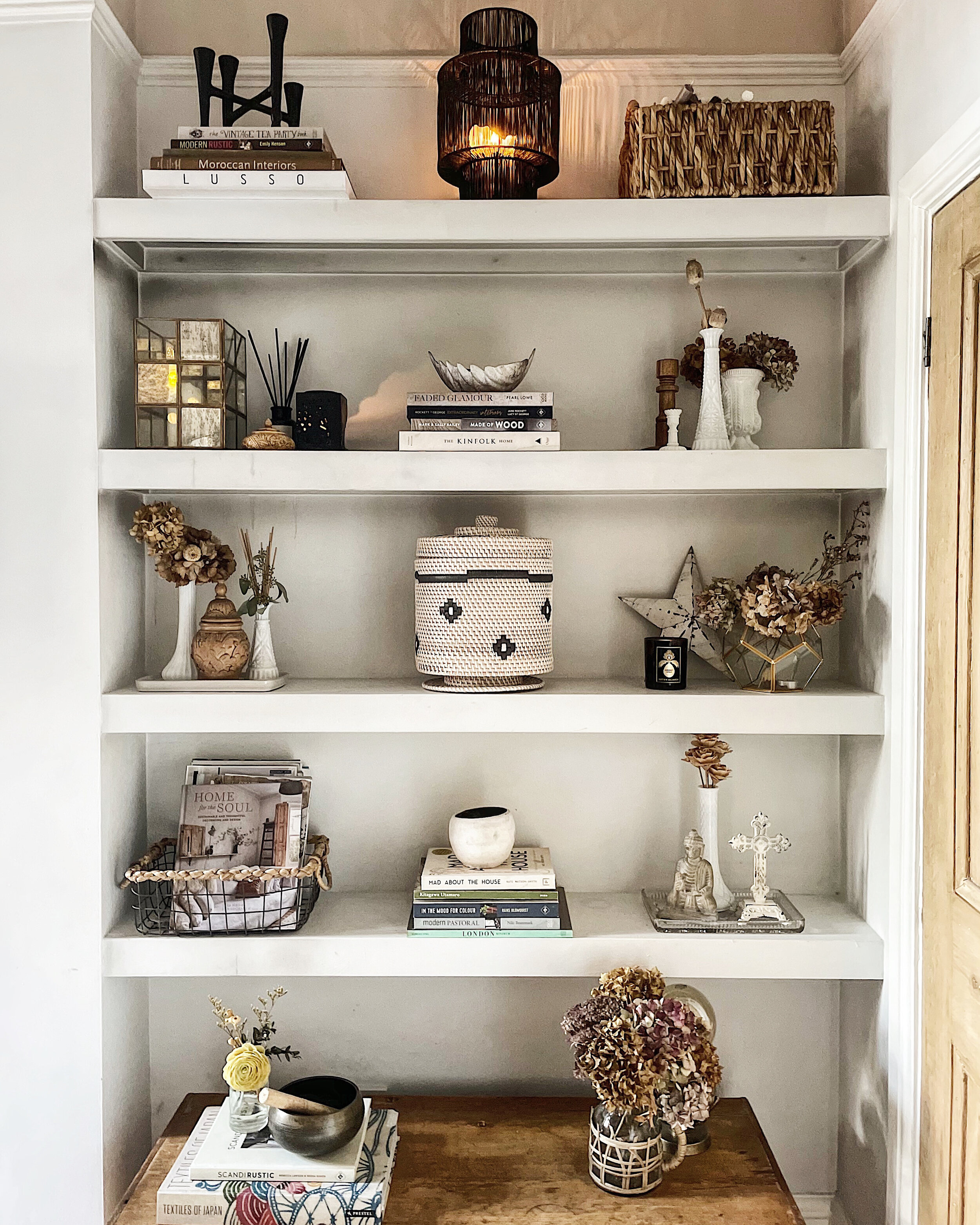
My Living room shelves, on a constant re shuffle!
These tips needn’t be confined to a shelf either, a lot of them apply to styling any horizontal surface. So whether you’re styling a mantlepiece, a sideboard or or a countertop these tips can all be applied. Hope you find them useful!
If I have a wall of shelves such as these in my living room I like to work in blocks. As you can see each shelf has 3 vignettes per shelf. This keeps things from getting too busy and cluttered.
In a vignette (fancy word for small group of objects) Odd numbers work best, an odd number of objects is more appealing and memorable and our eyes are forced to move around more which makes for a more interesting visual appearance.
In a set of shelves space out your larger objects rather than clumping them together.
Composition is key. If you’re a creative person this may be something that comes naturally to you or you may need to work at it. Keep moving your objects around until you find the perfect arrangement. I’m constantly shuffling my shelves around, are they ever perfect?!
Add the unexpected.
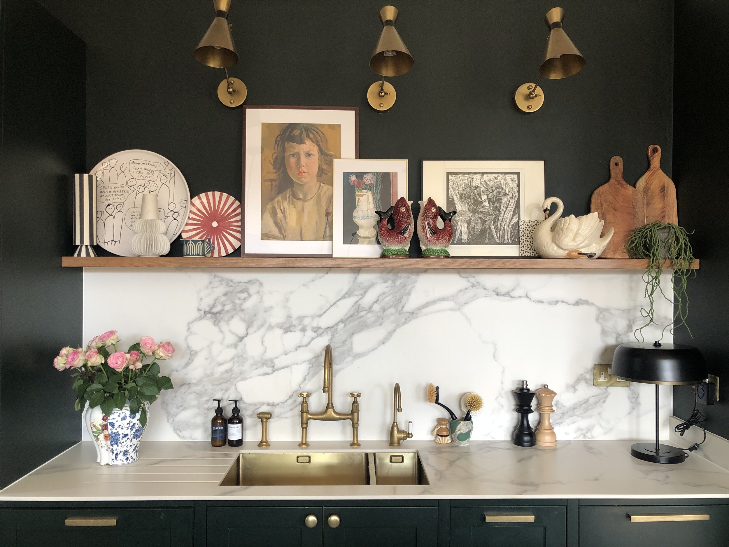
5. Sandra @the_idle_hands takes her shelf styling to another level by adding art to her kitchen shelves. Just because it’s your kitchen doesn’t mean that you just have to have kitchen paraphenalia on them!
6. Create personality by adding something unexpected to your mix of objects. A quirky sculpture or a kitsch souvenir, something that makes you smile every time you look at your display.
7. A shelfie is never complete without a trailing plant. My favourites are a string of hearts or a pothos, both pretty indestructible too!
8. Faff with them regularly! Our eyes stop registering something after time, we get ‘used’ to a certain scene or image, so rearrange them regularly to freshen them up.
9. Add a touch of magic and life with candles, in my eyes no shelfie is complete with out one or two.
10. Books, well it’s what shelves are meant for but not just any books. Stacks of beautiful coffee table books placed vertically and horizontally are great anchor points for small objects or vignettes.
Kitchen Shelving can be practical.
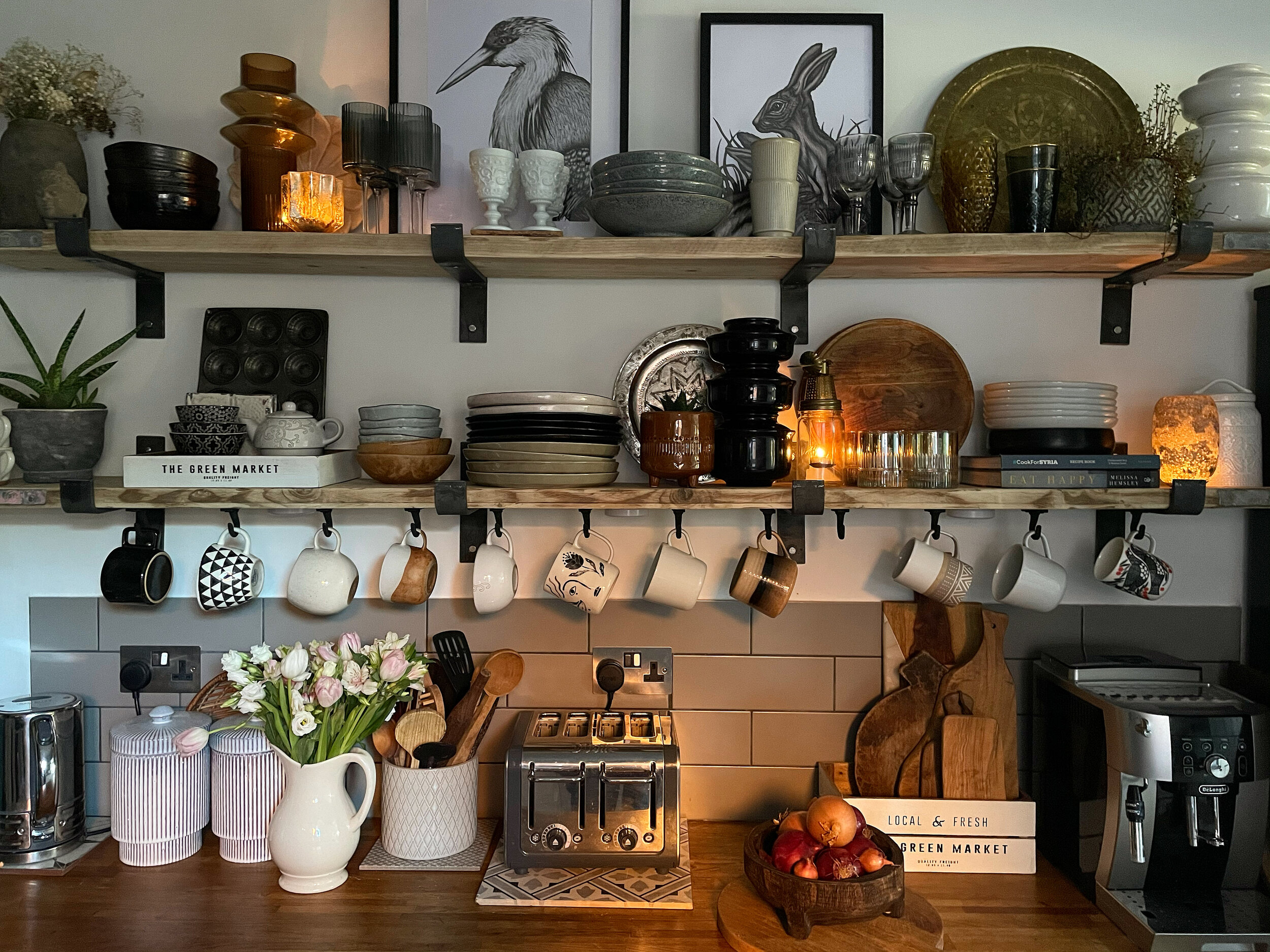
11. Open shelving in your kitchen CAN be practical, and it doesn’t neccesarily need extra cleaning. Have things on your open shelves you use daily and they won’t get dusty!
12. Be sustainable and use reclaimed materials for your shelves. I’m a huge fan of reclaimed scaffold boards for not only their beautiful texture but you’re helping the planet by using something that may just have ended up in land fill.
13. Use every surface of your kitchen shelves and maximise their use. I’ve added these iron cup hooks under neath to display my mug collection. You can buy similar here
14. Think about negative space. All of your shelf (or sideboard, these tips aren’t restricted to shelves they can apply to any horizontal surface) Not every square inch should be filled. Allow your objects to breathe.
15. Mix up your textures. Not just reserved for shelf styling, this would be my top styling tip anywhere. Even if all of your items are the same colour and tone mixing up and placing contrasting textures next to one another creates depth and soul to your shelves. A metallic candle holder next to a rough concrete vase and a smooth stone planter with a feathery fern for example.
16. Try varying the height of objects along your shelf or surface. On a sideboard or mantel I think it looks good to have height at either end with lower objects central.
Add Nature
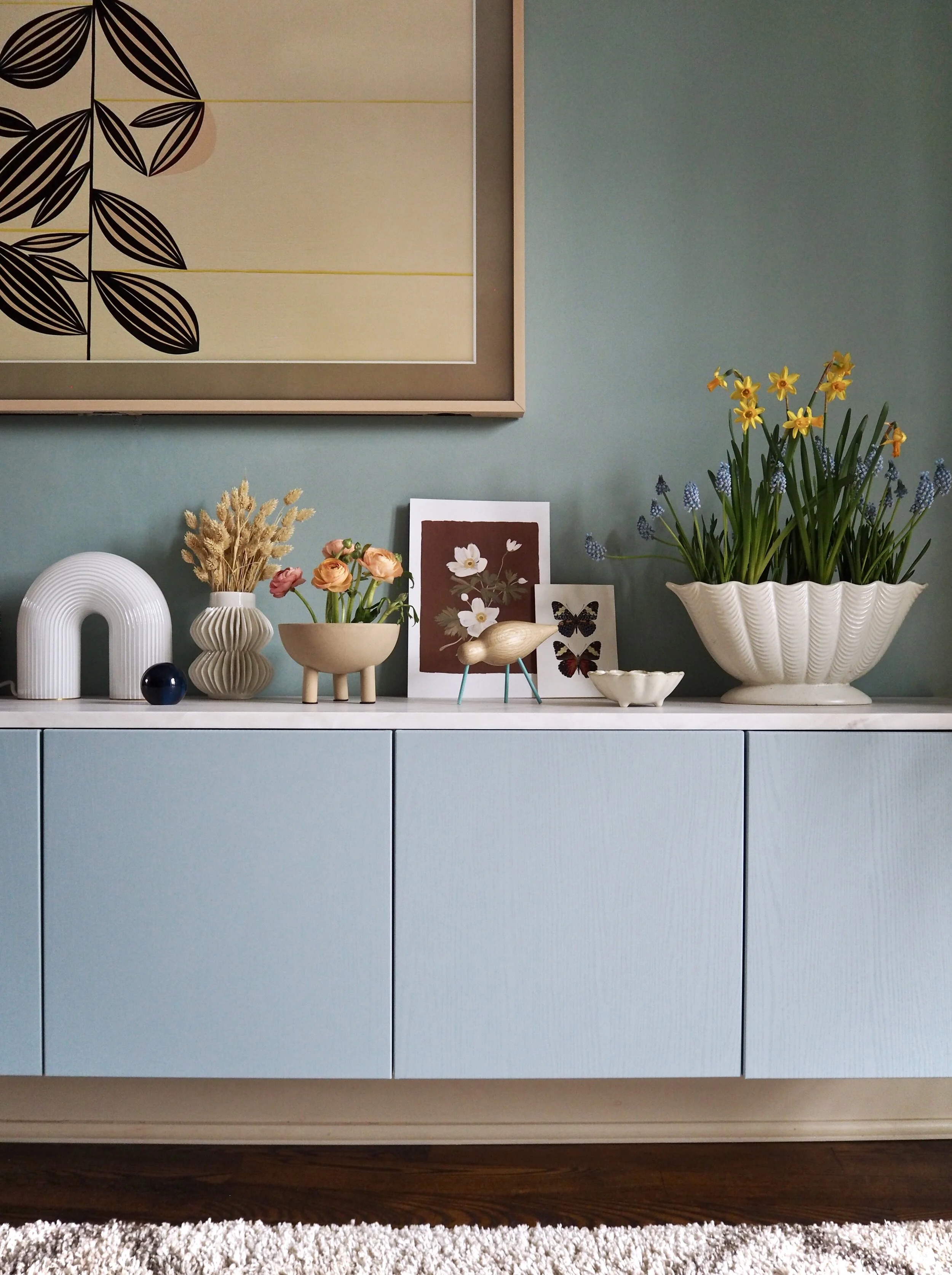
17. Include flowers either fresh or dried to add colour and life to your display. @Melanielissackinteriors mixes up real and dried here on her beautifully styled sideboard.
18. Create depth. Consider where things are placed from back to front. At the back create height with a framed print, against that position a medium sized vase with maybe a smaller object like a pretty shell or trinket at the front.
19. Take everything off your shelf when you start. You want a blank page to begin. Layer up gradually with your bigger pieces first.
20. Use trays to anchor objects in your displays, they will elevate them to something more special and eye catching.
21. Think about adding framed prints, they can just be casually resting against the wall and are another way of adding some height to your arrangements.
22. Add baskets or pretty storage boxes. Not only do they add texture but you can keep bits and bobs in them that you don’t want on display.
Make a statement
23. Display collections. I like to group together for example my collection of milk glass and my Buddha heads on my shelves. Rather than splitting them up, grouping collections together has far more impact.
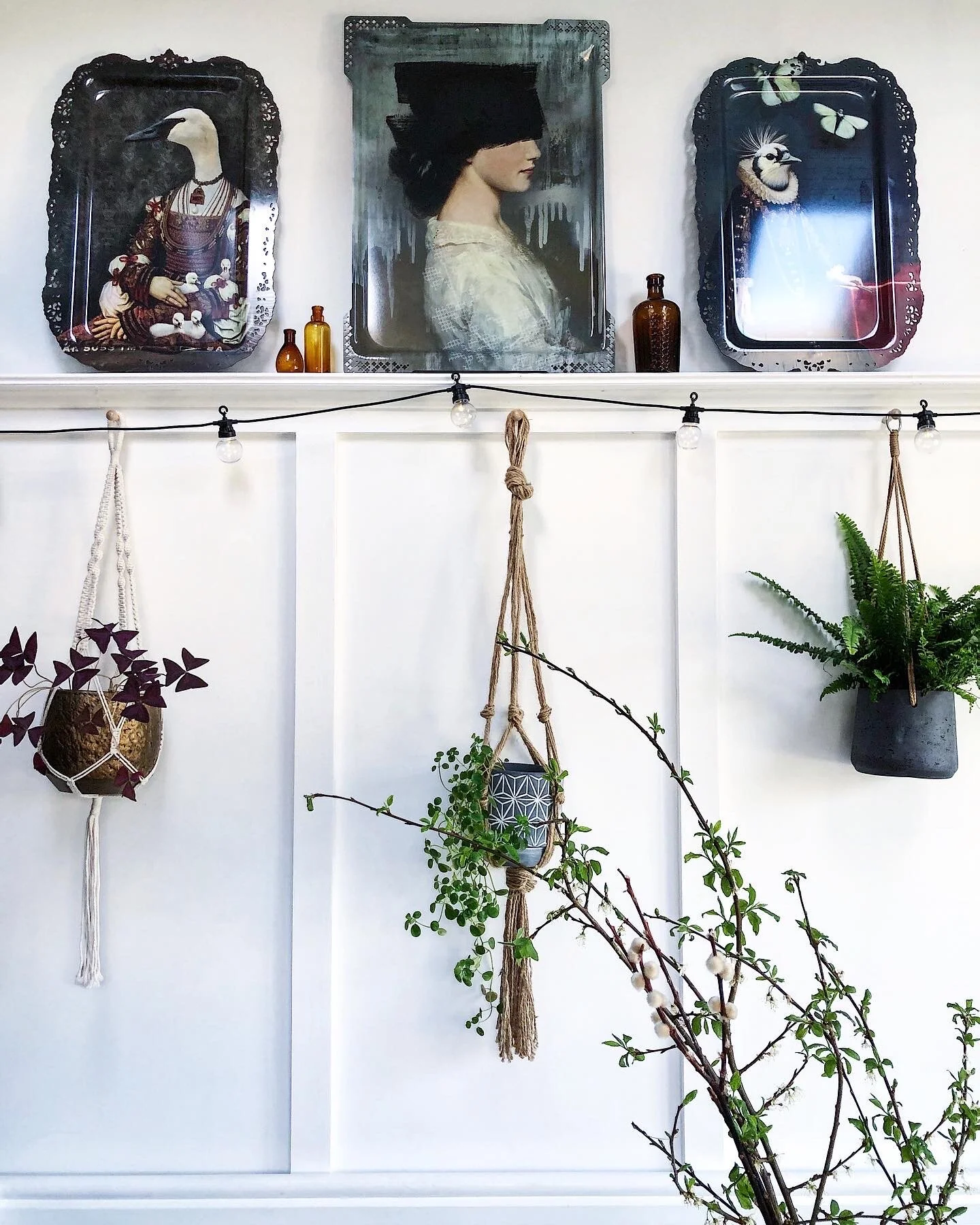
24. This trio of Ibride trays creates an interesting focal point on a picture shelf above a panelled wall.
25. Be creative, it doesn’t have to be a tray, use a pretty trivet or a vintage tile to add a quirky touch.
26. William Morris famously said ‘have nothing in your house that you do not know to be useful or believe to be beautiful’ I think with shelves unless it’s kitchen ones only have beautiful things, no one needs to see those oh so useful TV remotes or box of spark plugs on your shelves.
27. Try having one ‘hero’ piece to draw the eye to.
28. Shop your home for pieces to style your shelves. No need to go out and spend money, you’ll be amazed what you can find around the house!
Less is More
29. Keep your colour palette restricted to create a harmonious feel.
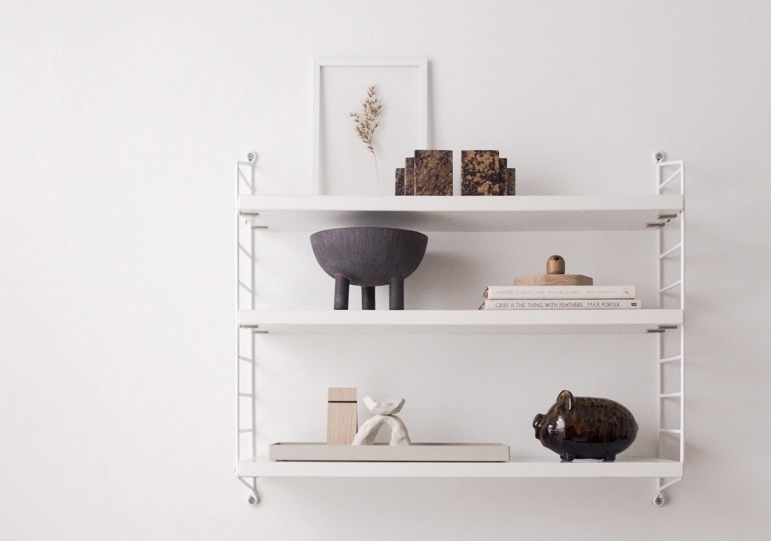
30. Consider different style shelves these String shelves create a cool scandi vibe in @thecrapflat Emma’s minimalist home.
31. Add height. Rather than everything being on the same level add a stack of books and place a vignette of objects on top.
32. On kitchen shelves, here I think is the place to display useful items, when I say useful I suggest pretty chopping boards of different materials and sizes not your husband’s chilli sauce collection! That’s strictly for behind closed doors.
33. Magazines can look great on shelves, either facing outwards stacked in baskets or magazine holders (not your Hello mags though, keep those hidden in in the loo!) Or in neat stacks to again add height and as a base for small collections of things.
Colour Pop
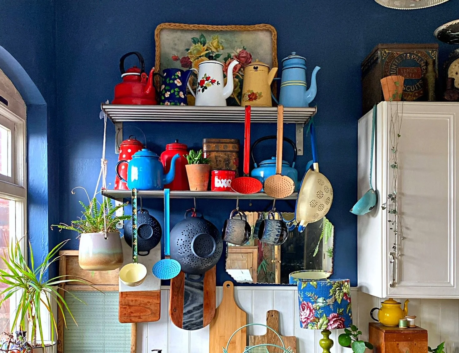
34. Alternatively if you want to mix up your colours try and keep a collection of objects within a theme. Demonstrated beautifully here on @Lisa_ loves_vintage a kitchen shelves with her amazing collection of vintage enamelware.
35. Vintage is always a good idea, don’t be the oldest thing in your house!
36. Kitchen open shelves are surprisingly practical, it’s much quicker to grab your favourite mug or find a bowl rather than opening and closing cupboard doors. There’s a good reason why restaurant kitchens have open shelves.
37. Books, now this may be controversial, but if you’re not liking the look of your multi coloured book spines, turn them round. The soft muted tones of book pages look far more attractive than the garish title of those at Alan Sugar autobiographies the OH insists on hanging on to (plus god forbid no one reads them anyway!)
38. In a set of shelves space out your larger objects rather than clumping them together.
39. Another way to display your books is to colour code them. This gives a more harmonious feel. I love books arranged in rainbow colours.
Use colour in a creative way
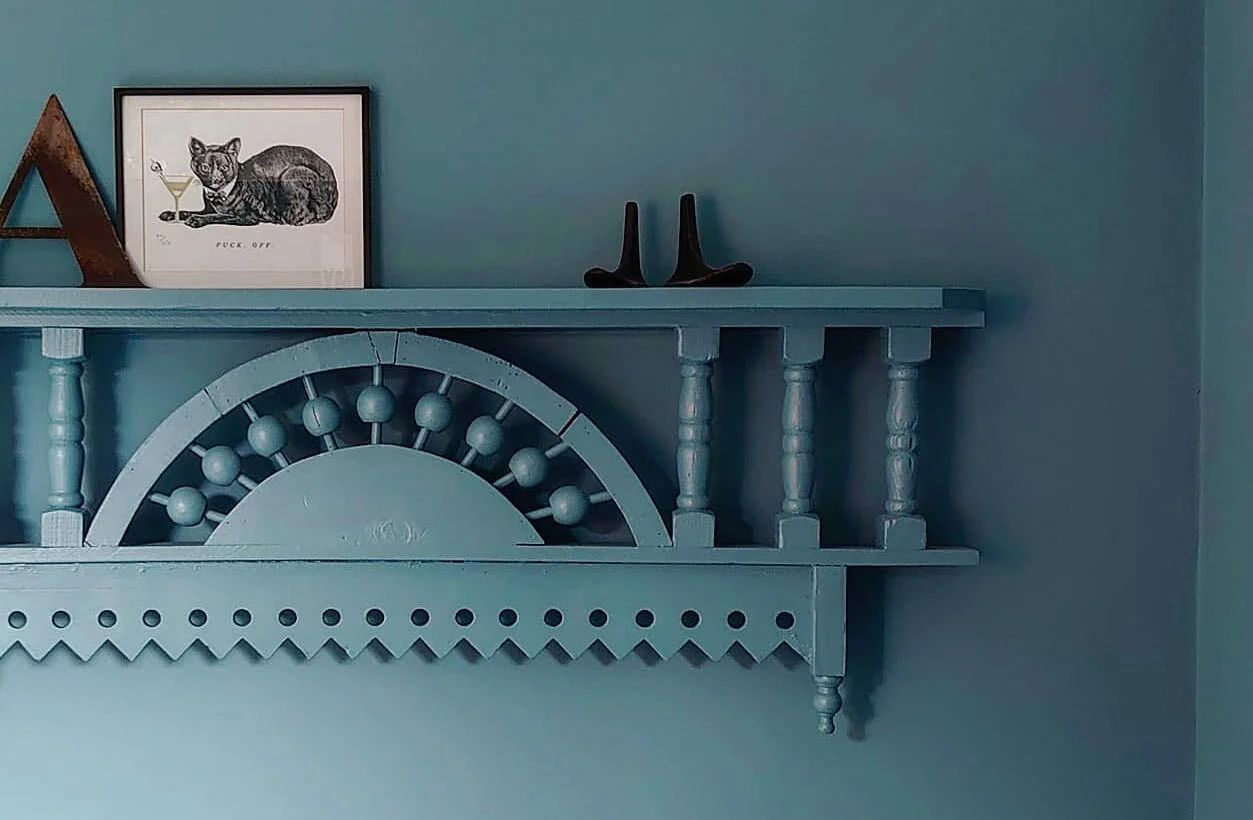
40. Paint your shelving the same as the wall colour @piecreative has used this unique vintage piece to create a beautiful shelf. Painting it the same colour as the wall takes it to another level.
41. Be creative with paint. Think about the wall behind your shelves. If your shelves are in an alcove consider either painting the shelves or the wall a contrasting colour to make them more of a feature.
Add Pattern
42. Wallpaper can make a fantastic backdrop to your shelves I love how @melaniejadedesign has added wallpaper to the back of her shelving unit in her under stairs space.
43. Mix up the placement of your books, some stacked vertically others horizontally. Then align some to the left, right and centre of a shelf.
44. Add a vase filled with items. You might want to add a large jar with tea lights or shells, or anything that showcases your personality or interests.
Go Green
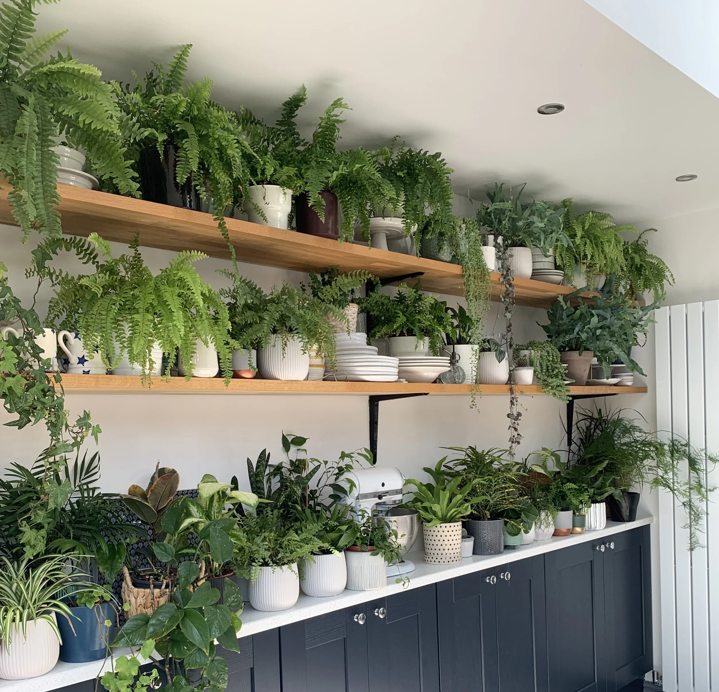
45. Add plants, and then for a real statement, add more! Mo of @mo.and.the.jungle.shelf has the ultimate plant shelfie!
46. Shelving units can often be in darker corners or alcoves so consider adding faux plants and flowers if you want to use them. Dowsing and Reynolds and Abigail Ahern both have a great selections of faux plants and flowers.
47. Add metalic pieces, they will add a bit of bling and elevate your shelfie. No need to stick to one metal either, mix them up!
48. If you’re going for lots of bright colours on your shelves consider adding a few neutral items to tone it down. This creates balnce and ensures your shelves don’t look too overbearing or mis matched.
49. Stand back and edit. Do you need to add more or is it too busy? Do you need to inject some colour or balance out your objects?
50. And finally one of the most important things is to display items you love most. Our homes are where we tell our stories through the things we choose to display and surround ourselves with. Items that speak to you and recall your life experiences will create a space that is trully unique and one that will be a joy to live in.
I hope you found these tips useful!
Theresa x
